Step 1:

Background:
- First I chose a bright colourful background that wasn't too bright to take over the masthead, but colourful enough to catch the buyers eye, and to really bring on the pop genre theme. To do this I chose a pale turquoise colour from the colour pallet, and from here I knew that would be adding turquoise in my colour theme.
Masthead:
Looking at the magazines I have analysed such as 'we love pop' magazine, I decided that for my masthead i needed it to stand out, and again such a bright background I thought that a white box would be suitable to do so. To come up with the name of my masthead, I know I wanted to use the word 'pop' as this immediately lets the audience know that the genre is, and the masthead name will be easy to grasp for young buyers. The name is almost like a play on word.
- To do so, I used the rectangle tool to create a white rectangle, in which I filled the border with back using the paint bucket tool. This to me creates a simple standard foundation ready for my masthead to form onto.
- To create the masthead, I thought it would be a clever idea to interpret 'pop art font' onto my magazine, as I know that this attracts young audiences, its fun and very in your face, and it also fits very well with my genre. For the words 'pop starz' I wanted the colours to be very similar as blue was one of my main colours in my pallet. I used the font 'Bangers' in 100pt. I thought this font was very pop art, and really stood out when I edited the words layers.
- To edit the words layers, I right clicked to start editing. I didn't want the masthead to look flat on the page, and so I 'beveled' it to 103px. This gave it that pop art effect. I also gave it a glow so it looked like the light was shining on it, almost giving it the feel that the masthead is in the spotlight, this made it look less flat. To get the black border around the font, I used 'stroke' 59xp which really made it noticeable against my blue background. Obviously to get the words matching I did exactly the same for both.
- Taking inspiration from the magazine 'we love pop' I though that to add that bit extra, a heart would be ideal for young eyes. To do this I used the custom shape tool which created the heart shape as it is. I then used the colour pallet to pick a bright colour. Looking at other pop magazines I noticed there was a lot of pink used that really made that magazine look the part. Once again I edited the layer style in which I 'beveled' to the size 125xp. Without this it looked flat and unnoticeable.
Step 2:


- By using the lasso tool on Adobe Photoshop, this allowed me to add my own background. I wanted to do this because the background already provided was dull and grey, and had no definition to it, however the blue background I chose by using paint fill, is much more brighter and makes my image pop. I needed my image to pop so it didn't look incredibly flat.

Main Image:
- For my main image I used the polygonal lasso tool to cut around her. It was very hard to cut around her hair and so I've decided to cover certain parts to hide the sharp edges. When I moved the cut out onto my background, it looked very flat and it didn't look as good as it should. This was due to the lack of shadow and smoothness. So to do this I edited the layer style and used the 'drop shadow' to add a shadow in the highest size 250xp, distance is 49xp, and the opacity was 80xp.
Selling Line:
I know a lot of the magazines I have analysed have had a selling line, but they more or less sounded all the same. I knew I wanted some kind of selling line but I wanted to be a bit different. Instead of using the standard sentence saying its the UK's number one mag, I decided to write what is guaranteed in the magazine, things that girls of a young age will enjoy reading about.
- To create the yellow rectangle I used the rectangle tool which I filled the bottom of my mag with ready for words to be added. I used the brighter yellow there was as I noticed on a lot of pop music magazines aimed at young teens, lots of yellow was used, again I took inspiration from 'we love pop'. I didn't think it was necessary to edit the layer style as it was right at the bottom that went from side to side, it wasn't noticeable.
- I then added words to it, almost as a list to indicate this is what you are expecting in the magazine. I used the font 'Bangers' once again just in a smaller font so it wouldn't look out of place with the rest of the writing. Black to me is very plain and simple, but it was the one colour that fitted perfectly against a yellow border. To add a bit of colour to my selling line, I decided to use bright pink forward slashes to separate the different topics. I thought about my target audience here and what would they want in a magazine. And finally i came up with the main 6 things I think went well.
I quickly added a barcode from the internet as it filled space up. I did consider whether to put it on the front and if so where to put it, but most magazines had the barcode either on the left/right bottom corner.
Step 3:

Freebies:
I thought that when aimed at such a young audience, it would be a lot easier to sell a magazine when they see the word 'FREE'. I made it clear that it was a free poster of 'Eliza' which is the girl as my main image. This would encourage them to buy this magazine as it may be their idol, but most of all kids love posters and they are popular and ideal for this target audience.
- To do the shape, I used the cookie cutter tool, and then went to the top of the page to choose a suitable shape. I have noticed that on any type of magazine, whether it be a music mag, food, women, TV mag etc, anything free has more or less been in the shape of a star. As I wanted to keep my colour palette to a certain amount of colours I used the eyedropper tool to select the colour from my yellow border at the bottom of the page, to then use as my star colour too. This is so I don't have different shades of yellow.
- As many of the things I have used so far I have had to edit their layer style so they didn't look so flat and unbearable. I used the drop shadow to give it a bit more colour, depth and shadow to it. I beveled it to make it pop more. I knew that to put this is the top right corner next to the masthead would be a good idea as this is mostly likely to be at eye level, and will be the thing that they most likely look at next.
I dont define the clothing to be advertisement as such, but I thought it worked well as to an extent it was trying to sell the clothes that were supposedly 'in fashion for that season'. When the buyer reads what clothing is in fashion and individual clothing form a particular seller such as 'new look and H&M' this will make the buyer want to go and buy those clothes. I came up with the cover line 'fashion to fall for this summer' as it really is believable and intriguing. I left this cover line as it was as the black font 'Impact' didn't seem to make a difference to how flat it looked.
Step 4:
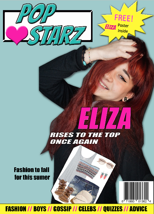
I thought it was very important that the main cover line was the name of the girl in my main image. My colour pallet I have again stuck to certain colours, I chose a bright pink as it stood out against her black jumper, it also compliments the heart in my masthead.
- I used the font 'Impact' as this was simple and easy to read. I used italic to slightly slant it, which is in the same motion as her head. The size is 108pt and I used the eyedropper tool to select the pink colour from the heart. This is helpful so I don't have different coloured pinks, it works well having no more than 5 colours that are the same.
- I edited the layer style to bring it out more and make it look like it is the main cover line. To do this i used bevel 48px, and stroke 32px to give it a slight black border. I knew it was very important for the main cover line to stand out and this is the main tory line in the magazine. I made it slightly smaller than the masthead as its not quite important, so I placed it in the middle of the front cover which is where they are found most.
- The cover line beneath it 'rises to the top again' sounds very achieving, and this is part of the main cover line story. I beveled this in the size 29xp and used the font 'Impact' the same as the main cover line. This is so they didn't contrast closely together and look out of place. I chose to use white as it was the only colour that made the writing stand out against her black jumper and red hair.
Step 5:

White Box:
I thought that having a white box to put the cover lines on will make them easier to read and would fill the page up more.
- I used the rectangle tool to form the rectangle, and then used the colour pallet to make it white.
- Then in this box I have two cover lines that indicate what current celebs have said to the magazine company. These are two story lines that are to be read in the magazine. I decided to highlight the celebs names in blue as this one of my main colours, and also this would make it clear to young readers who has said it. And then underneath are the speech marks. I chose back as most of my cover lines are in black, it stood out well against the white background, and also it complements her black jumper.
Other Cover Lines:
- 'QUICK TURN TO PAGE 12' is almost like an order, and as its aimed at young teens, they will more than likely turn to page 12 without even thinking about it. It is is capitals so it comes across as more of an order compared to the other cover lines. I used the font 'Impact' in size 24pt. I thought that I had already at this point used a lot of white, and black was clear to read against the blue background. To make it clear what page to turn to, I thought it would be a good idea to make it stand out with a pink box. To do this is used the rectangle tool, and then used the eyedropper tool to take the pink from the heart in my masthead, to use as the box colour. This is so the pink is spread out evenly across the magazine and it looked better to have one shade of pink. Black writing didn't stand out as much against this pink box, and so I changed the font to white which was a bit different but it worked very well. So the box didn't look so flat on the page, I edited the layer style to use bevel 46px.
- '7 PAGES OF HARRY AND MEG' I think is a good cover line as it clearly states how many pages in the magazine is going to be about Harry and Meg which are also celebs. This will appeal to young teens if they are a fan of these two celebs, as 7 pages can include lots of information. To change up the black font, I chose to write in the same pink as the heart in my masthead using the eyedropper tool. And then underneath 'HARRY AND MEG' are in white and underlined in the font 'Impact' 26pt just like the rest of the cover lines.
Step 6:

Even More Cover Lines:
I have around 8 cover lines, and so I felt the need to change them in some way so they didn't all blend together, even though it would look very sophisticated that way, my genre 'pop' was screaming out to be bright bold and different.
- 'MUST SEE PHOTOS' sounds very intriguing, and I thought it would be very effective for young teens. To do the shape i used the ellipse tool to create a circle, in which I stretched to make it more of an egg shape. I wanted to place this shape here so it would hide the sharp edges of the white box behind it. I chose purple as its bright and it fitted well with the rest of the colours I have used. The font is 'Bangers' the same as my masthead font.
- I did the same for the second circle which says 'MY MOST REVEALING INTERVIEW YET'. This is very captivating, and will entice young readers to buy the magazine. White writing stood out the most against purple.
Step 7:

- When I came to making my double page spread, I found it was easier to have the main cover line match my story on the double spread. And I decided to change the cover line from "rises to the top once again" to "it was love at first sight". This gives me the opportunity to go into more detail about a celebrity couple on my double page spread.
Possible photos:

- I decided on this one in the end as she was giving direct eye contact, she was smiling and she had a good strong posture. This angle of the camera is a medium close up, and shown her jewellery off very well.

- I didn't use this photo as I felt she needed to be making direct eye contact as this connected more with the audience.

I took many photos of this model as I thought she represented the ideal pop singer very well. Her hair is very vibrant and bold which stood out as a statement in the photos. The jewellery she wore was simple but also fitted well with the pop requirements. Her clothes consist of a black jumper and a white shirt underneath like a 'peter pan' collar. I knew this was in fashion and would bring out a good fashion inspiration to my target audience. The black jumper made the models hair stand out extremely well, and as I knew I was going to use the lasso tool on Adobe Photoshop to cut her out against a blue background, I also knew this would make her whole image pop.
(I asked the model for permission before picking up any camera) In most of the photos I took, the model is giving direct eye contact with the camera. This is more intriguing to the readers as it screams out 'BUY ME'. I got her to use many hand motions and different poses to get a different image each time, so then I had a wide variety to choose from in the end. Body language is very important. She needed to look happy, friendly, and really excited about the pop industry, as I thought this is what will inspire my young target audience the most as role models. So coming to a conclusion, this was why I chose to use the first photo for my front cover image. She looks happy and is making direct eye contact.
No comments:
Post a Comment